


In the split second it takes for a potential customer to glance at your brand, colors are already working behind the scenes to influence their emotions, perceptions, and purchasing decisions.
Color psychology isn’t just a marketing buzzword—it’s a powerful scientific principle that can dramatically impact your business success. From the trust-inspiring blue of Facebook to the appetite-stimulating red of Coca-Cola, the world’s most successful brands have mastered the art of strategic color selection.
Understanding how different hues trigger specific psychological responses allows marketers to create deeper connections with their audience, boost brand recognition, and ultimately drive more conversions. This comprehensive guide will unlock the secrets of color psychology in marketing, showing you how to harness the emotional power of color to transform your brand’s impact and effectiveness.
People are extremely visual by nature, which is why color plays more of a role in our lives as consumers than we may think. Learning to use color psychology in your marketing and branding can boost your company’s success astronomically. Whether we realize it or not, colors affect our emotions when we see them. This is because of color psychology. Picking the right color for your website, product, or ad can make or break its success.
Effective color psychology techniques can cause consumers to not only remember your brand but also keep them coming back. A company that demonstrates color psychology in its marketing wonderfully is McDonald’s. The yellow color used in their famous golden arches logo emits feelings of joy. That feeling of joy mixed with the matching slogan of “I’m loving it” is what causes people to keep coming back. In this article, you will learn how color psychology works and the importance it plays in great marketing.
What is Color Psychology?
- 1 What is Color Psychology?
- 2 Psychology of Color in Marketing
- 3 Ways to Use Certain Colors in Your Marketing
- 4
- 5 Examples of Color Psychology in Marketing
- 6 Using Color Contrast in Your Marketing
- 7 Colors Have to Have the Right Name
- 8 How Personal Characteristics Play a Role in Color Psychology Marketing
- 9 Addressing Color Blindness
- 10 Color Psychology in Marketing
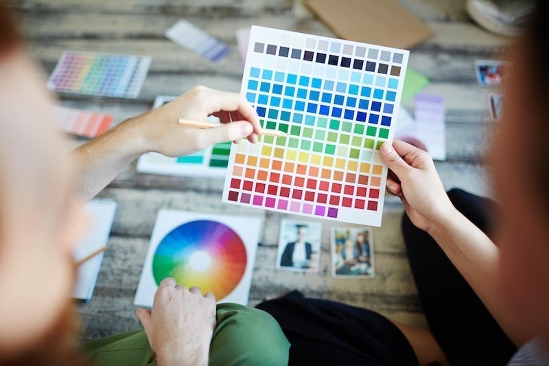
Color psychology is the study of color hue and its effect on human behavior. Color can subconsciously influence human perception. For instance, colors influence the taste of food. Colors have certain qualities that can cause emotions in people. People use phrases every day that come from the basis of color psychology. Looking green means you are sick, feeling blue means you are sad, and seeing red means you are angry. While we might have personal preferences when it comes to different shades on the color wheel, there are certain ways that bold colors or accent colors make us all feel.
Psychology of Color in Marketing
The psychology of color in marketing focuses on how certain colors impact a consumers’ impressions of products and whether or not they persuade a purchase. There is a reason companies heavily test the colors of their marketing campaigns and advertisements. When HubSpot did a button color test, they found that a red call-to-action (CTA) button beat the green one by 21%.
Ways to Use Certain Colors in Your Marketing
Let’s discuss how you can use different color palettes as part of your brand identity:
Red
- Words (both good and bad) associated with red: passion, energy, excitement, danger, and warning.
- It creates a sense of urgency, so it works really well for sales and call-to-action buttons.
- It is used frequently in fast-food ads because it can enhance a person’s appetite subconsciously.
- Can get the human pulse racing and because of this, red has become synonymous with energy drinks, fast cars, and lingerie.
Orange
- Words (both good and bad) associated with orange: courage, innovation, warmth, immaturity, and ignorance.
- People associate darker shades of orange with autumn/fall, which is great if you have a more “earthy” brand.
- Most people, however, associate brighter oranges with being cheap. This could be used in your favor if that’s the angle you are going for.

Yellow
- Words (both good and bad) associated with yellow: optimism, warmth, happiness, caution, and anxiety.
- You do need to be careful with the shade/tint of yellow you use. Darker shades can look dirty and brighter tints can be overwhelming for the eyes.
- Yellow can be very eye-catching when used as an accent for darker colors.
- Additionally, only 1% of people listed it as their least favorite color in marketing.
Green
- Words (both good and bad) associated with green: health, prosperity, nature, envy, and stagnation.
- It is a relaxing color that is easy on the eyes no matter the shade or tint.
- Very common and effective in any health brand, from pharmaceuticals to organic foods and even nature conservation projects.
Blue
- Words (both good and bad) associated with blue: trust, loyalty, serenity, coldness, and emotionlessness.
- Blue has an extremely calming effect on the senses. It also causes a sense of trust, which explains its popularity among banking branches.
- Additionally, it ranks very high as a favorite color among people.
Purple
- Words (both good and bad) associated with purple: wisdom, wealth, spirituality, excessiveness, moodiness.
- Lends itself well to brands that want to make the customer see them as prestigious. Purple is a color people relate to royalty.
- Darker shades can give off moodiness. While lighter tints are best used for companies trying to reach a mainly female audience.
Black
- Words (both good and bad) associated with black: elegance, power, sophistication, mourning, menacing.
- The color black lends itself well to luxury brands or brands trying to appear as such.
- Black can do very well in some industries (i.e. fashion), but really bad in others (i.e. health).

Examples of Color Psychology in Marketing
- Red Bull’s red logo and branding bring forth feelings of intensity and energy; which for an energy drink company is exactly what you want.
- The color orange emits feelings of creativity which is the purpose of Home Depot.
- Black is a symbol of sophistication and simplicity. Chanel is a luxury brand, so they want people to feel sophisticated while shopping with them.
Using Color Contrast in Your Marketing
Contrast is how a certain color stands apart when put next to another. It’s what makes text or objects jump out at you and not blend into the background. High contrast is when colors easily stand apart from each other. Low contrast is when they don’t.
Most people assume that a color difference creates a high contrast, but that’s not necessarily true. You can have two colors that are extremely different but have absolutely no contrast because their tone is too similar. A great way to test out your contrast is to make them grayscale and review their contrast and differences that way.
It is also important to consider your choice of colors in your social media marketing. You do not want to cause confusion like you are part of the platform if your colors are too similar. Make sure you choose colors that are unique to your brand.
Colors Have to Have the Right Name
The names of colors on your products also play a huge role in successful color psychology in your marketing. The more descriptive the name, the better your products will do.
A study by the name “A rose by any other name …,” proved that the name of colors matters almost as much as the color itself. When people were asked to rank two products, whose only difference was the color name, fancier names were substantially preferred. For example, “mocha” was found to be significantly more likable than “brown.”
This is even important for children’s products. Crayola’s crayons with names like “razzmatazz” and “banana mania” were chosen by children way more, over ones with names such as “lemon yellow” or “red-purple.”
How Personal Characteristics Play a Role in Color Psychology Marketing
There are a large number of additional factors that influence the perception and reactions certain customers have when they see particular colors. Marketers should be aware of what these factors are and how they can use them to boost the success of their marketing campaigns using color psychology in marketing.
Gender
A study found that the preference of most people is for the color blue. The study found that 42% of people prefer the color blue. This is why you see so many companies’ homepages use the color blue as their primary source of color. The same study found that people dislike orange (28% of people) and brown (24% of people) the most. It is safe to say that in most cases, you should avoid those colors as a primary color.
The study also suggests that having a largely bright color scheme for your homepage would be beneficial for a male audience, and a soft color scheme is better for an audience that is mainly female.
Age
When examining your audience, age is a component to consider carefully. Your target audience’s age can affect how your marketing materials are perceived, especially considering color preference varies based on age.
When walking around the grocery store, you may notice that the boxes get much more widely colored as you look toward the bottom shelves. This is because young children are drawn towards snacks with characters, a lot of color, and patterns.
Addressing Color Blindness
Words of caution: Red and green, which are complementary colors, present quite the problem. Red and green are a common problematic combination for people who have color blindness.
To help with color blindness when using complementary colors, remember there must be high contrast. Also, try to never use color as the sole information source. Always include text in graphs and infographics whenever possible as well. Making your content interactive makes it much more appealing to those who may not be able to see your color scheme.
Color Psychology in Marketing
Honing skills in effective color psychology can at times feel sort of complicated. It is extremely important, though, because of how visual consumers are. The message of your company needs to verbally tell the consumer what the color makes them feel. It’s the feeling, mood, and image that your brand or product creates that influences color psychology in your marketing.
Again, McDonald’s message of “I’m loving it” and the children’s meal that are referred to as “Happy Meals” tell the customer that the yellow logo color is a symbol of joy. It is the combination of your message, logo, and color that makes your color psychology effective in your marketing campaigns.
Learn how to use color in branding and as part of your marketing strategies with SEO Design Chicago!
Contact Us today!