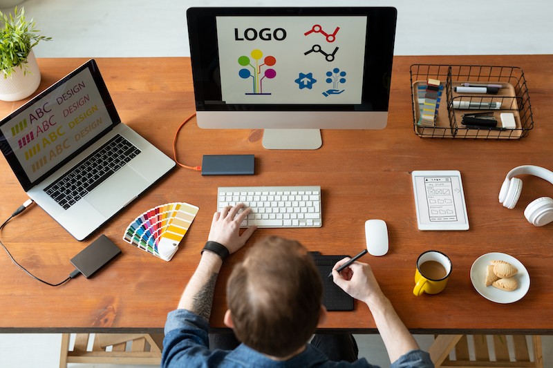
As a new small business, one of the most important things is to create your logo. This is the beginning of building your branding to your consumers. A logo is a central part of your business’s branding, and it is usually the first point of contact for potential consumers. Therefore, it’s crucial to make sure that when you make a logo, it truly represents your brand and can connect with consumers. In this article, you will learn about what a logo is, how to make one, and the characteristics to create a great and successful logo.
Table of Contents
What is a Logo?
Logos are texts, images, shapes, or a combination of the three that depict the name and purpose of a business. However, a logo can and should be more than a symbol of identification. If designed well, it also tells a company’s story by conveying your brand message in a way that helps to establish an emotional connection with your target audience.

What Does a Logo Do?
A logo is important for a number of reasons, mainly being that it does the following:
- Makes a great first impression, which invites customers to interact with your brand
- Helps you to create a brand identity
- Gives your company a symbol through which people can better remember you
- Distinguishes you from competitors
- Fosters brand loyalty
How to Make a Logo
Before you start creating your design it’s important to keep two things in mind. First, design is a lot of strategy, so be prepared to do a lot of thinking and decision-making before you start drawing. Second, you’re not just designing a logo. A logo is only part of a larger visual system, and its individual pieces all need to work together.
There are numerous resources that will let you design a logo for free, and some will even allow you to download it for free as well. Some great resources that will allow you to create a great logo for free are:
- Logomakr
- Free Logo Design
- Logo Type Maker
- Designimo
- Logo Garden
- Design Mantic

Characteristics of a Good Logo
The 8 characteristics of a successful business logo design are as follows:
- Simplicity
- Differentiation
- Relevancyr
- Memorability
- Scalability
- Versatility
- Legibility
- Quality of execution
Simplicity
The most important thing that a logo should do is be identifiable, so you want to make sure that it’s simple. If your logo is too complex or has too many details, then your audience and consumers won’t be able to recognize and remember your brand.
Differentiation
Branding is the only thing that helps your business separate itself from the thousands of other businesses out there. Branding also helps consumers know which products they love and trust. Logos are designed as the identity of the brand, which is a key factor in consumers purchasing products. In order to separate and identify your company from another, the design needs to be distinct. It must be immediately recognizable and not look like anything else in the landscape it’s in. This means that you need to have a full understanding of what competitive landscape your business will be compared to. A large part of this is design research. To give your business or product the greatest chance of success, the logo and identity should be sufficiently different from its competitors in order for people to quickly and easily recognize and remember it.
It’s important to remember that the logo is one small piece of the overall brand identity, so you don’t need to create something entirely original for the logo alone. It just needs to be sufficiently unique when compared to a direct competitor. The details surrounding the main idea – the packaging design, the bottle shape, the color combinations used, the image style, the fonts, etc. that will make the most impact. The logo is simply the tip of the iceberg.

Relevancy
It’s important to make sure that your logo is different, but also sits comfortably in the field your business is in. There’s a certain aesthetic that consumers expect to see in each industry. Designing something too different from that would be confusing to consumers. When you’re designing your business’s logo, it’s important to understand what the aesthetics are for the industry your business is in. This is something you can pull from your own experiences in your business. You can also research existing logos and brand identities to establish and better understand what they are. Research is key when you’re targeting a country or culture that you are not familiar with.
Memorability
Memorability should be the aim of the design of your business’s logo. People remember shapes faster, which is a key reason why a logo should be simple and contain just one idea that is memorable. If your logo is distinct, it will also assist with the memorability of your logo.
Understanding the competitive landscape your business is in will allow you to create a logo that not only stands out, but will be remembered by consumers as well. Colors go way beyond aesthetic appeal. They’re the core communicators of your message that you want your logo to convey. They tell your audience if you’re playful or serious, innovative or wholesome, cutting-edge or timeless and stable. Your logo color palette can be made up of a single color or several, but no more than two or three. It’s important to remember that the colors of your logo will seep into other branding materials that you will create for your brand in the future.
Scalability
While this is a more technical characteristic, scalability is one of the most important characteristics of your business’s logo. We live in a world where the logo you create will be seen in places such as social media. In that context, the logo size will be very small. Logos that scale well are those that are simple, so when you’re designing your logo, make sure to zoom in and out to ensure that your logo is legible in smaller sizes.
It’s also a good idea to test your logo on mockups, to ensure that it works effectively in real life small applications, and is still legible and recognizable from a distance. When designing your logo, it’s important to think about the different variants of your logo for different sizes. For example, you should have a variant that works more effectively at small sizes. If you have a project where you know your business’s logo will be commonly used in small sizes, it’s worth creating an extra variant for those situations.

Versatility
A successful business logo design will work effectively in a wide range of situations. Creating a versatile logo will ensure that it will be immediately recognizable, look its best no matter what size of the area it’s placed in, or the color or material it’s placed on. One way to achieve this is by having a variety of configurations, which are known as “lockups.” For example, if the logo is a symbol with supporting wordmark, you might have a variant with the symbol to the left, and another with the symbol above the wordmark. If the company name is made up of multiple words, you might have variants where one is the full name on a single line of text, and another where it’s stacked. You will also want to consider background colors too. For example, you might have the main logo that’s used on a white background and another that’s inverted to work on darker background colors.
Legibility
If you, or your consumers, cannot clearly see what your business is called by looking at your logo, then that will be a problem for growth. If the wordmark on your logo can remain clearly legible on your logo, stick with it. Otherwise, avoid it at all costs. If you’re in the process of designing a logo and you are unsure if it’s clearly legible, it’s worth asking others if they can read it. If there’s any doubt about legibility, change your design accordingly.
Quality of Execution
A successful logo is one that’s been well executed and includes the perfect lines, shapes, and color palette. If there’s just one thing off on your logo, it can cause the design to look and feel unprofessional. This can include things like the design being too busy or a poor color choice. One of the most common mistakes in logo design is imperfect curves and shapes, or inconsistent spacing. These are both things that can be solved by using a grid system to ensure lines and spacing are correct.
FAQ:
- What is a logo?
- What is the purpose of a logo?
- How do you make a logo?
- What are the characteristics of a good logo?
- Why should logos be versatile?


Contact Us Today!